
Every Interior Designer’s Secret Weapon
Ever walk into a room and feel, “Woah, this just works!”
That’s the magic of a beautifully balanced colour palette. The 60-30-10 rule is one of the simplest, most reliable tools to hit that sweet spot - no design degree required! It’s that simple.

Ok but what is it, exactly?
The rule divides the colour palette of a room into three main categories:
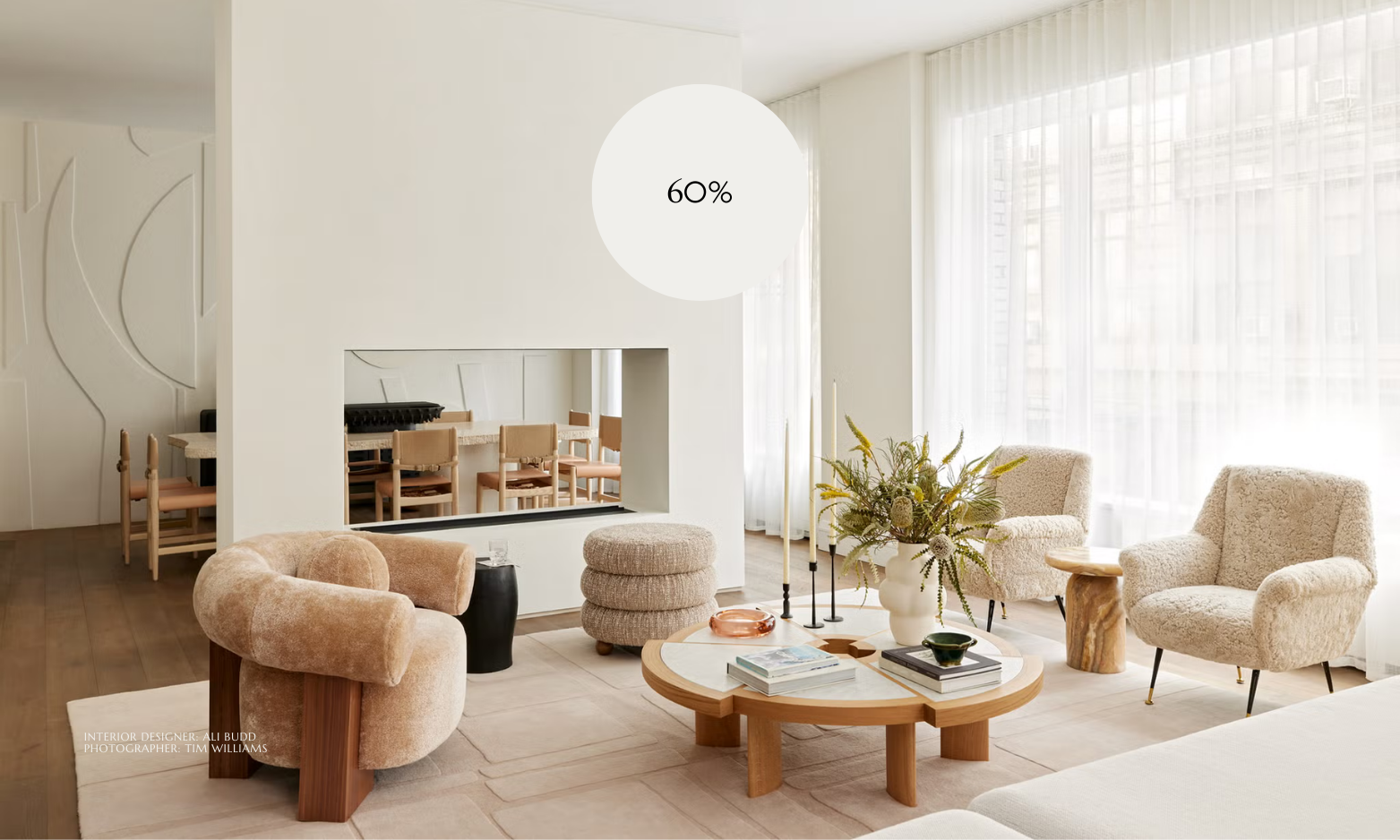
60% Dominant Colour
This is your base, the foundation. Think walls, large furniture pieces, or flooring — the tone that carries the mood of the room.
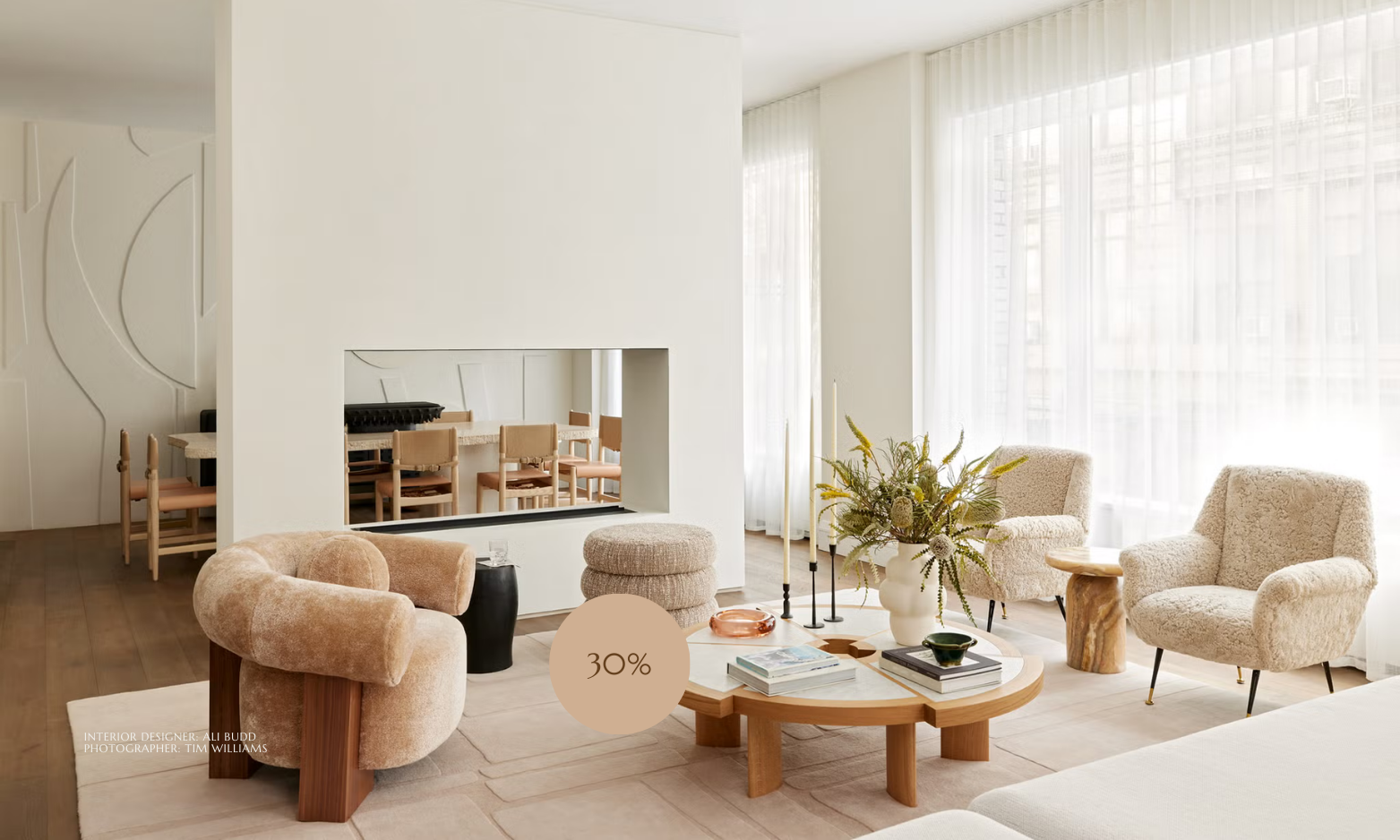
30% Secondary Colour
This colour supports and adds depth. You’ll see it in upholstery, rugs, curtains, or medium-scale furniture.
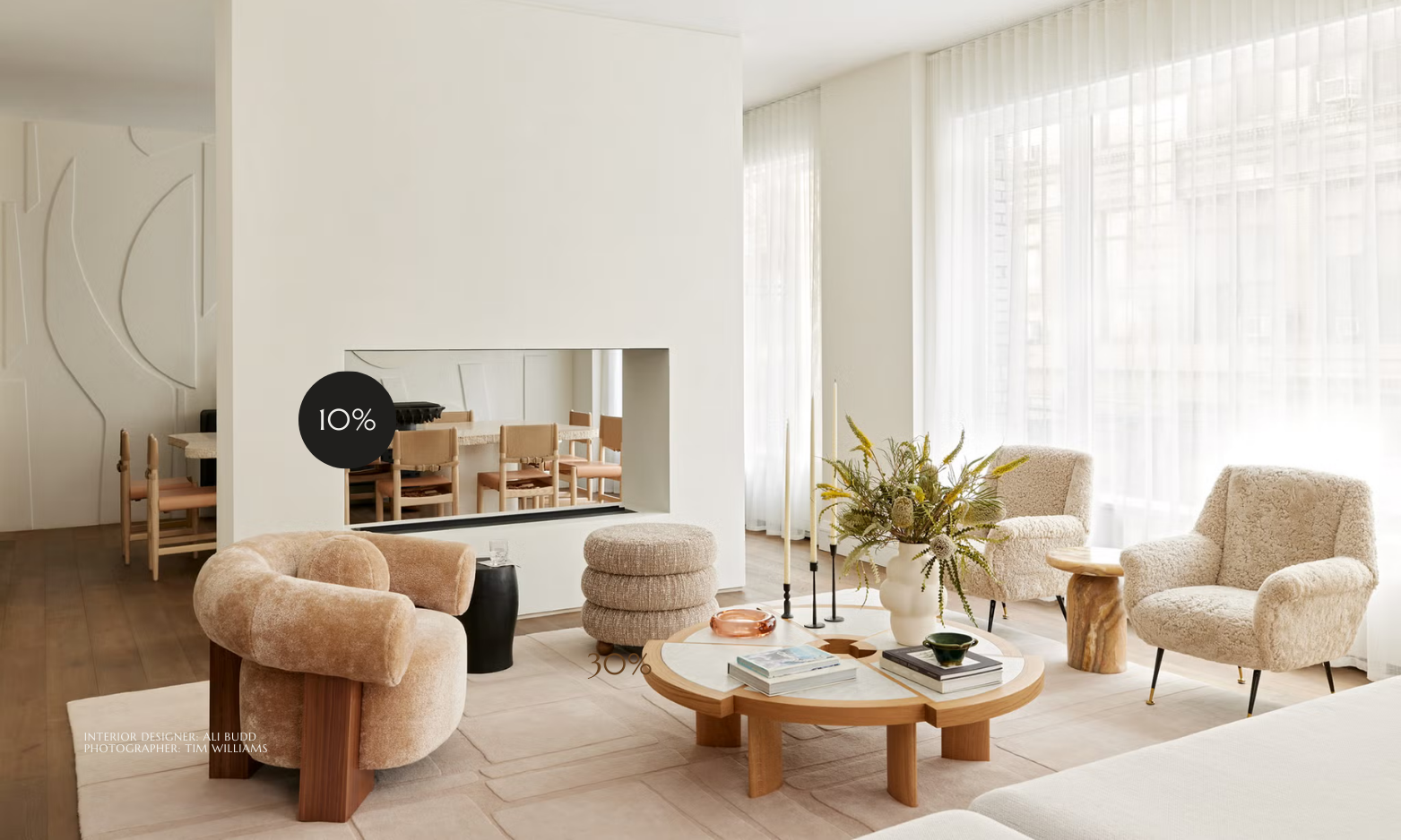
10% Accent Colour
The POP. This is where you get expressive — cushions, artwork, lamps, vases, small decor elements.
Why does it work?
BALANCE.
Too much of one colour, and things feel monotonous. Too many competing hues, and your eyes are distracted.
The 60-30-10 rule gives just enough structure to keep things grounded. It creates harmony that feels right, not forced. The Spruce and Apartment Therapy often cite it as a go-to for creating inviting, cohesive spaces.
Use these easy steps to apply this to your space:
1. Choose Your Colours Thoughtfully
Start with a neutral or muted tone for your 60%. It’s forgiving and gives flexibility. Pick a secondary colour that complements or gently contrasts with the dominant hue. The accent colour is your chance to have fun — bold, vibrant, or unexpected.
2. Distribute Colours Proportionally
Aim for about 60% of visible surfaces (walls, big furniture, floors) to carry your dominant colour. The 30% can cover curtains, rugs or a feature wall or hero furniture piece. Reserve 10% for bold, accent pieces that catch the eye!
3. Think Texture, Material & Finish
Colour isn’t just about hue. Use varied textures to make your palette richer and more sensory. Linen in the secondary tone, a velvet couch, metallic or glossy accents in that bold 10% - layering textures helps your colours feel alive.
Pro-Tips for Real Life
Use a starting point: Pick one item you love (a rug, piece of art) and build your palette from there.
Don’t stress the math too strictly!
Carry colours across rooms: Use your secondary or accent in multiple spaces to connect your home visually.